
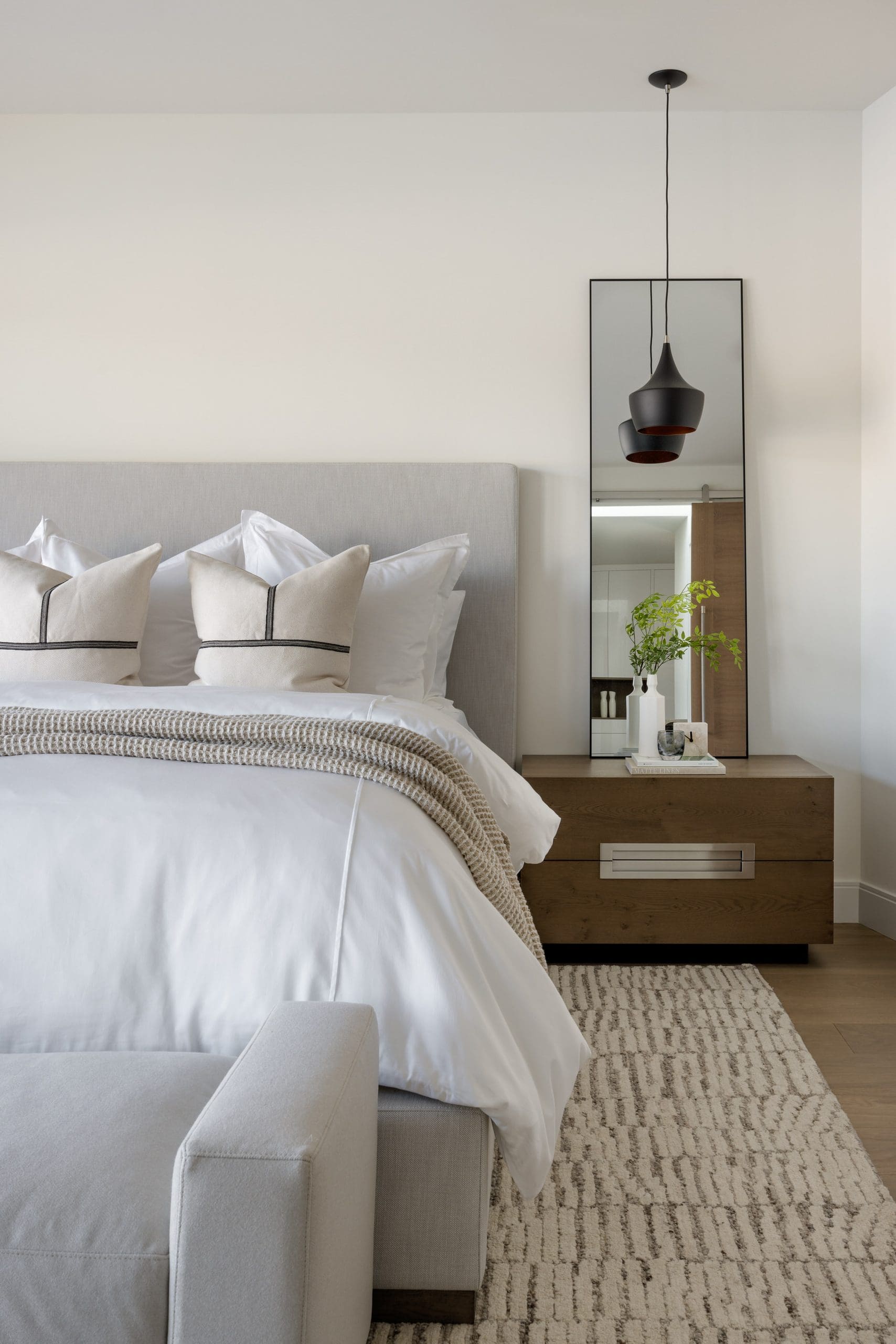
Read before you Paint: A Designer’s Guide To Choosing White Paint
If you’ve recently looked around your space and felt that a fresh coat of white paint would liven up the room, you’re not alone! White paint is a delightfully cost-effective way to brighten up a room, making it feel fresh, clean and full of new energy for whatever season of life you may be entering. However, choosing the correct shade of white can be a difficult task, especially if you are looking to avoid the lifeless feel of the wrong shade for your space.
If you’ve spent time investigating paint samples and swatches, you may be aware that some white shades lean warmer and some lean cooler based on the undertone. Most paint colors are a specifically selected blend of many pigments, typically blue, green, and purple undertones for cool shades and red, yellow, and orange undertones for warm shades.
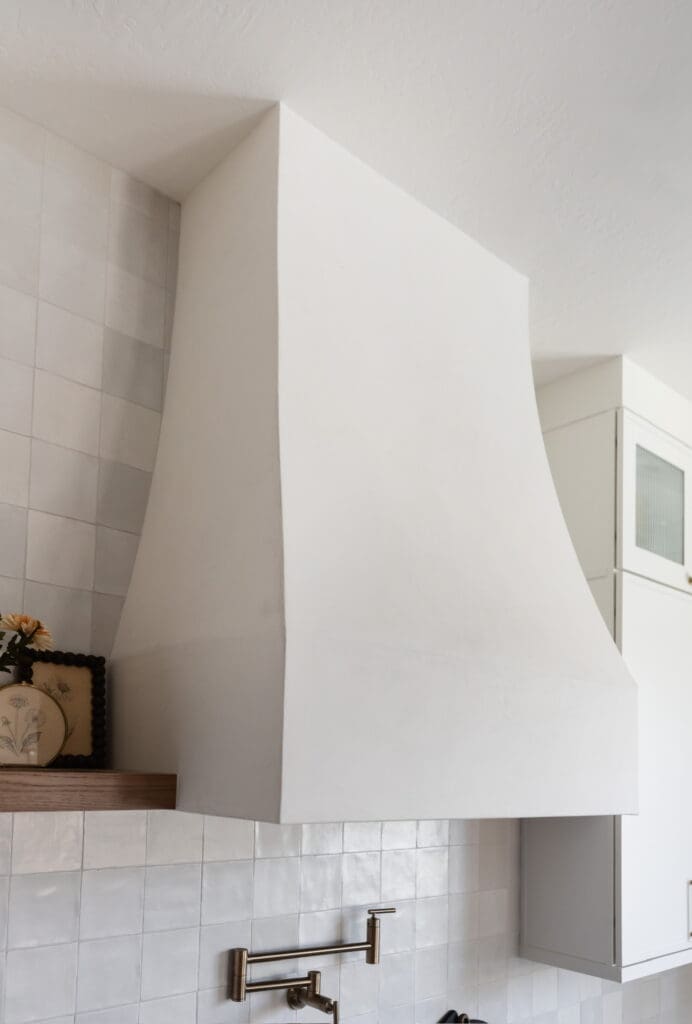
What to Consider About Your Space
The factor that many non-designers miss is how the room itself impacts paint tones.
If I was considering a white for the exterior of a home as a designer, I’m not only evaluating the style, aesthetic structure and accent colors of your home, but details such as the landscaping, street, lighting and more. If you have a very green landscape and a green leaning white paint, it will likely exaggerate the tone.
All of these factors will impact the way that the tone translates in your space.
The same concept applies to the interior of your home! Your flooring color, the amount of natural light in your room, furniture, art, design, accents and styling will impact how harmonious your paint shade looks in your space.
So, now that we understand how important our paint choice actually is, how do we pick a color? I’ve simplified my list into the following options below, which have been some of my favorites used in my recent designs.
My Go-To White Paints
- Sherwin-Williams Alabaster
Alabaster is one of our true go-tos. It’s a warm, soft white with just enough depth that it never feels bland. I tend to reach for it often in homes that want to lean into warmth throughout whether in living rooms, trim or cabinetry. It’s especially great in spaces with a lot of natural wood, brass, or warmer accents. It’s one of the most forgiving whites on my list that tends to look good in almost any light. - Benjamin Moore Swiss Coffee
Swiss Coffee is a rich creamy white without feeling too yellow, which is a delicate balance to perfect. I love it in homes that want a soft, inviting feel. I especially love it in more traditional or transitional spaces where a stark white would feel too sharp. It reads warm and lived-in rather than clinical. - Sherwin-Williams Pure White
This is my favorite clean & minimal option. Pure White is still soft, but noticeably crisper than Alabaster or Swiss Coffee. I tend to reach for Pure White in my modern leaning projects where the goal is a fresh, bright backdrop without going tipping into a cold office-like white. It’s a great choice for a clean aesthetic without feeling cold and unwelcoming. - Benjamin Moore White Dove
Arguably the most classic on the list, it is popular for a reason. White Dove is a gentle, versatile white that works in almost any space and application such as walls, trim and cabinetry. It’s a touch warmer than a true white but still reads neutral and supportive to surrounding materials which is why it shows up in such a wide range of homes and styles. I love it as a starting point when investigating whites for a space. - Benjamin Moore Chantilly Lace
When I’m looking for something bright & clean, Chantilly Lace is my first choice. It reads crisp without feeling cold, and it’s a good choice when I am searching to build contrast. I might use it as a bright trim against a rich wall color for example, or subtly in a kitchen that needs a breath of fresh air and brightness.
Don’t be afraid to personalize & sample

Your paint color selection is so unique to what you want your space to feel like. Going outside of the box is always allowed in order to perfectly suit your vision for the space.
Whether it be mixing tones or a unique color combination, these tips can help your space feel like the most calming, luxurious and curated version of your vision.
Because of all this, I always recommend sampling a color directly in your space at different times of day before committing to it on the walls.


[close]
Comments